Best Answer

Customized Page Design

  • February 19, 2026
  • 8 replies
  • 228 views

Forum|alt.badge.img+1

Hi Docebo Community,

I am working on designing a customised internal learning landing page in Docebo and would love some inspiration or best-practice ideas from others who have customized their pages.

Context:

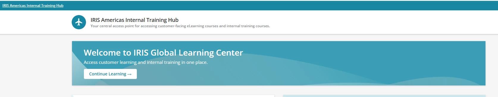
  • This is an internal enablement page (not a public catalog).

  • Added a custom HTML/WYSIWYG hero banner with branding, messaging, and a CTA.

  • The platform already shows the page name in a theme color system bar, and below that there is a white bar (page name + optional subtitle).

Challenge:
The white page title bar feels visually repetitive since the page name already appears in the system bar and we also have a hero banner below it. I’m trying to achieve a cleaner, more modern UI.

Questions for the community:

  1. Has anyone successfully hidden or minimized the white page name bar in Docebo?

  2. Is there a supported way to remove it via page settings, theme, or CSS (without breaking upgrades)?

  3. If hiding isn’t possible, how have you designed around it to make the page feel less repetitive?

  4. Any examples/screenshots of modern internal landing pages built in Docebo would be greatly appreciated.

Goal is to keep the design sleek, enterprise-style, and consistent with the platform while reducing visual duplication at the top of the page.

Thanks in advance for any ideas or inspiration!
 

Custom Page Design - Draft


Best answer by sjennings78

That was one of the first things we did when the update came out a long time ago to display the page title like that.  It really should be an option at the page level, to choose whether to show or hide it (with a simple checkbox), but it is not.  We had to use a CSS override to hide it.  We chose to hide it for all pages at the time but only recently removed the override and started using it again for other reasons. 

We did find that when it was hidden, if you opened up a channel, you did not get the Follow option on the page because the Follow button would display in the title bar, so we wound up putting in code to allow it to display for channel pages only.  

Check out this post with info about hiding the title bar:


8 replies

Forum|alt.badge.img+1
  • Helper II
  • February 19, 2026

I’ve never figured out a way to hide/disable the page heading bar for individual pages. It’s easy to do via CSS for *all* pages, but not for individual ones. IIRC, it doesn’t have unique IDs so nothing to target. But I haven’t tried it in a couple of years or so and haven’t been following this forum as closely - perhaps someone has figured out a way, or Docebo has changed something on their end to enable it. 


Ian
Guide II
  • Guide II
  • February 19, 2026

I’ll just briefly link to this post I shared a little while back, because the second example involves hiding the title bar for a specific page. Don’t really have time right now to comment on Point 4, but hope this helps anyway.


dwilburn
Guide III
Forum|alt.badge.img+4
  • Guide III
  • February 19, 2026

You need that title bar for buttons on some of the Docebo pages.

For pages you are creating, grab the number (from the address bar) for the page and build this to add to your CSS.

/* Remove Title Bar on specific pages */

.doc-layout-main:has(:is(
#doc-page-55,
#doc-page-54,
#doc-page-53,
#doc-page-52,
#doc-page-51,
#doc-page-50,
#doc-page-49,
#doc-page-48,
#doc-page-45,
#doc-page-43,
#doc-page-42,
#doc-page-41,
#doc-page-40,
#doc-page-39,
#doc-page-38,
#doc-page-35,
#doc-page-28,
#doc-page-26,
#doc-page-25,
#doc-page-23,
#doc-page-21,
#doc-page-20,
#doc-page-19,
#doc-page-18,
#doc-page-17,
#doc-page-16
))
#doc-layout-title-bar {
display: none;
}

/* End solution */


sjennings78
Guide III
Forum|alt.badge.img+7
  • Guide III
  • Answer
  • February 19, 2026

That was one of the first things we did when the update came out a long time ago to display the page title like that.  It really should be an option at the page level, to choose whether to show or hide it (with a simple checkbox), but it is not.  We had to use a CSS override to hide it.  We chose to hide it for all pages at the time but only recently removed the override and started using it again for other reasons. 

We did find that when it was hidden, if you opened up a channel, you did not get the Follow option on the page because the Follow button would display in the title bar, so we wound up putting in code to allow it to display for channel pages only.  

Check out this post with info about hiding the title bar:


Forum|alt.badge.img+4
  • Helper III
  • February 19, 2026

You’ve gotten some great suggestions from others, but my only caution would be to remember that this custom CSS and HTML won’t show up in the app.  As we have started to see greater adoption of the Go Learn app we have had to roll back some of our customizations that ended up making navigation harder on the app.  You can have an app specific landing page which solves for some of the issues, but that adds to the pages you’re needing to maintain, so just beware :)


  • Novice III
  • February 19, 2026

Following but would also like to add we have had some related challenges - in our case the header does not align with the page window which just looks very poor. If anyone has suggestions on how to correct this with CSS please share, we have exhausted PS on this and have had no luck to date.


Forum|alt.badge.img

We spent a LOT of time working on our landing page learning dashboards as well as pages for our catalogs and learning plans. There are some elements of how pages and some widgets work natively that didn’t work for us, so we’ve used quite a bit of CSS to hide/modify certain things. For example, the native “My courses and learning plans” page doesn’t fit our needs, so we hid the link to the native one at the bottom of the task widget and added an html widget to our version of “My Training”. We also had issues with how the breadcrumbs work, so we have them mostly hidden in our platform, and have created our own breadcrumb paths as html widgets at the top of pages where it would be needed.

We only have internal learners and then those who manage them, so we have 2 main landing page “dashboards”, one for My Learning and one for Management. The top of both have banner graphics with a “Welcome to...” message overlaid and some key points/purposes.

The My Learning Dashboard has a My Tasks widget as 2/3, and next to it an html widget we call Quick Links. Below both of those in 1/3s are My Courses Dashboard widget (just shows a pie chart), My Badges widget, and some custom images that link to main areas of our platform like “New & Featured” and learning plans. Below all of that is a full screen course calendar widget.

The Management Dashboard one has a bit more on it. There is a 2/3 section of links to our Manager How-To microlearning videos, a section for Manager Shortcuts (enroll in courses, enroll in learning plans, reports, view my team), and an Admin Tasks widget. The right 1/3 is Quick links and some custom images that link to main areas of our platform like “New & Featured” and learning plans. Below all of that is a full screen course calendar widget.

As you likely know, while Docebo allows for a lot of customization, the more customized and sophisticated something is, the more work it is to manage and maintain, so I recommend keeping that in mind and clearly notating your CSS and have external lists etc to keep track of what may need to be maintained and checked periodically. 


Forum|alt.badge.img+1

You’ve gotten some great suggestions from others, but my only caution would be to remember that this custom CSS and HTML won’t show up in the app.  As we have started to see greater adoption of the Go Learn app we have had to roll back some of our customizations that ended up making navigation harder on the app.  You can have an app specific landing page which solves for some of the issues, but that adds to the pages you’re needing to maintain, so just beware :)

Thanks for sharing this - really helpful perspective. After seeing the inputs and suggestions on the compatibility across devices, I am more leaning towards retaining as such, prioritizing functional consistency over aesthetics