Best Answer

header image to full width

  • July 16, 2026
  • 3 replies
  • 89 views

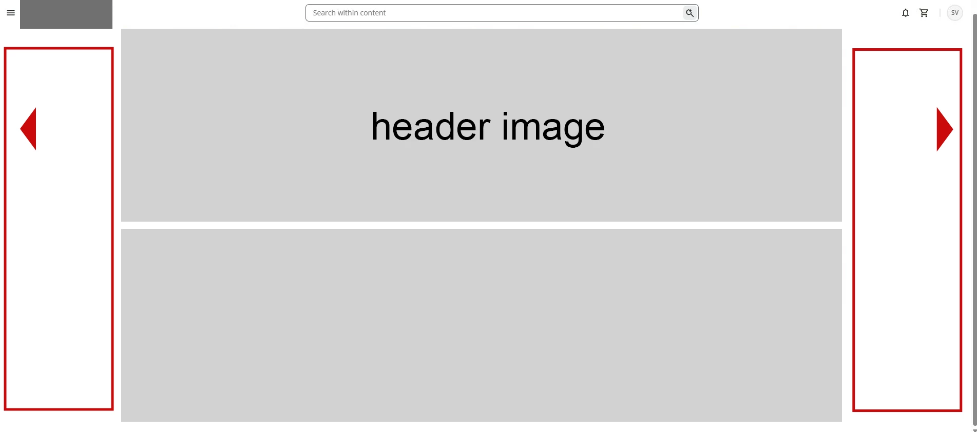
I'm not sure if I'm just missing the option, but I'd like the header image to be full width and responsive to the browser window size.

Ideally, the content wouldn't be restricted to such a narrow container, leaving so much white space on the left and right.
 

Does anyone know if this can be achieved with custom CSS and HTML?

Best answer by Ben Bauman

I'm not sure if I'm just missing the option, but I'd like the header image to be full width and responsive to the browser window size.

Ideally, the content wouldn't be restricted to such a narrow container, leaving so much white space on the left and right.
 

Does anyone know if this can be achieved with custom CSS and HTML?

Hi there, great question and here is the answer

Shout out to the Netflix L&D team from this years conference for sharing the pro tips!


you can test the CSS and make it page specific, so you don't break your entire platform (until you rebuild all your pages)


/* Target a specific page ID container */

[data-page-id="PAGE_ID"] .doc-page-container,

[data-page-id="PAGE_ID"] .dcr-page-container,

[data-page-id="PAGE_ID"] .dcr-page-content {

    max-width: 100% !important;

    width: 100% !important;

    padding-left: 0 !important;

    padding-right: 0 !important;

}


[data-page-id="PAGE_ID"] .doc-widget-row {

    max-width: 100% !important;

    width: 100% !important;

}


3 replies

Forum|alt.badge.img+1

What % Zoom do you have your browser at? When I have mine at 100%, it fills my page. Only when I have it at a smaller % (which I usually do because I like to be able to see more content at once) does the space on the sides get bigger.


Forum|alt.badge.img+1

I will add that it also depends on your screen width. My above comment was based on my laptop screen. On my wider desktop screen, there’s still some space on the sides at 100%. 



Ben Bauman
Helper I
Forum|alt.badge.img+1
  • Helper I
  • Answer
  • August 25, 2026

I'm not sure if I'm just missing the option, but I'd like the header image to be full width and responsive to the browser window size.

Ideally, the content wouldn't be restricted to such a narrow container, leaving so much white space on the left and right.
 

Does anyone know if this can be achieved with custom CSS and HTML?

Hi there, great question and here is the answer

Shout out to the Netflix L&D team from this years conference for sharing the pro tips!


you can test the CSS and make it page specific, so you don't break your entire platform (until you rebuild all your pages)


/* Target a specific page ID container */

[data-page-id="PAGE_ID"] .doc-page-container,

[data-page-id="PAGE_ID"] .dcr-page-container,

[data-page-id="PAGE_ID"] .dcr-page-content {

    max-width: 100% !important;

    width: 100% !important;

    padding-left: 0 !important;

    padding-right: 0 !important;

}


[data-page-id="PAGE_ID"] .doc-widget-row {

    max-width: 100% !important;

    width: 100% !important;

}