


Using Custom CSS to enhance the Courses/completion Status badges

  • Jul 23, 2025 9:07 PM UTC
  • 9 replies
  • 490 views

pierre.andignac
Docebian
Forum|alt.badge.img

You’re looking to personalized the courses status badges (not started, in progress, completed)?

Below, you'll find a code snippet that you can insert into your Custom Styles 💡:

/* *********************************************** */
/* Course Status Label Colors - Card, List, Channels */
/* *********************************************** */

/* Not Started */
.ui-badge-status-success,
.ui-list-item-status-not_started .ui-badge-status-success {
background-color: #020050 !important;
color: #ffffff !important;
}

/* In Progress */
.ui-badge-status-neutral,
.ui-list-item-status-in_progress .ui-badge-status-neutral,
.ui-card-status-in_progress .ui-badge-status-neutral {
background-color: #F7681E !important;
color: #ffffff !important;
}

/* Completed */
.ui-card-header:has(+ ui-card-content span.color-accent-tertiary) .ui-badge-status-neutral,
.ui-list-item-status-completed .ui-badge-status-neutral,
.ui-card-status-completed .ui-badge-status-neutral {
background-color: #008767 !important;
color: #ffffff !important;
}

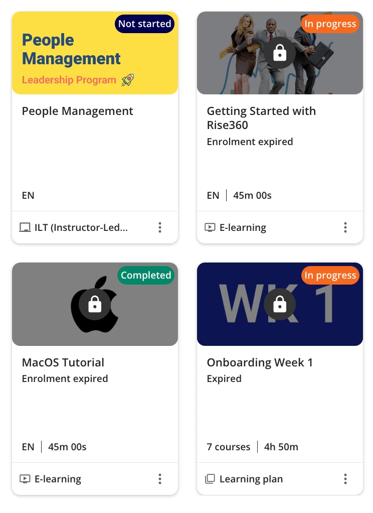
Go ahead and modify the color codes (#XXXXX) to your preference. Check out the examples below to see how the badges have been updated:
 

Hope it helps!


Similar articles:

9 replies

lrnlab
Hero III
Forum|alt.badge.img+10
  • Hero III
  • Jul 24, 2025 5:17 PM UTC

Nice, thank you.


Bouben
Influencer I
Forum|alt.badge.img+1
  • Influencer I
  • Jul 28, 2025 2:15 PM UTC

A must have !! Thank you Pierre


  • Contributor I
  • Mar 10, 2026 2:18 PM UTC

Hey! I used your code ​@pierre.andignac , and it worked, but not totally when I applied it. The colours on the In progress and Completed status badges are the same, and seems it seems the completed badge get overwritten by the css to In progress (see image below):

I used the same code as you, only changed colours and added border.


/* In Progress */

.ui-badge-status-neutral,

.ui-list-item-status-in_progress .ui-badge-status-neutral,

.ui-card-status-in_progress .ui-badge-status-neutral {

background-color: #FAE6C6 !important;

border: solid 1px #666666;

color: #333333 !important;

}


/* Completed */

.ui-card-header:has(+ ui-card-content span.color-accent-tertiary) .ui-badge-status-neutral,

.ui-list-item-status-completed .ui-badge-status-neutral,

.ui-card-status-completed .ui-badge-status-neutral {

background-color: #DAEDDD !important;

color: #333 !important;

}

I have tried so many times to check the code or try out other code, but nothing works out. Do you know what I potentially have done wrong and how to fix it?


pierre.andignac
Docebian
Forum|alt.badge.img


Let me investigate, and get back to you in private ​@NiniG 


  • Contributor I
  • Mar 30, 2026 8:15 AM UTC

Did you ever find out what could cause the code not working? ​@pierre.andignac 


rmahmsani
Novice II
Forum|alt.badge.img
  • Novice II
  • Nov 13, 2026 11:37 AM UTC

the same with me i have inprogress and completed in the same color


pierre.andignac
Docebian
Forum|alt.badge.img

Hello  ​@NiniG, apologies for the delay I must have missed your response!

Could you please try the below code?  FYI ​@rmahmsani 

/* Font and and color */

/* Not Started */
.ui-badge-status-success,
.ui-list-item-status-not_started .ui-badge-status-success,
.ui-card-status-not_started .ui-badge-status-success,
.ui-card-header-badge-success {
background-color: black !important;
color: white !important;
font-weight: bold !important;
}

/* In Progress */
.ui-badge-status-neutral,
.ui-list-item-status-in_progress .ui-badge-status-neutral,
.ui-card-status-in_progress .ui-badge-status-neutral,
.ui-card-header-badge-neutral {
background-color: red !important;
color: white !important;
font-weight: bold !important;
}

/* Completed */
.ui-card-header:has(+ ui-card-content span.color-accent-tertiary) .ui-badge-status-neutral,
.ui-list-item-status-completed .ui-badge-status-neutral,
.ui-card-status-completed .ui-badge-status-neutral,
.ui-card-header-badge-primary {
background-color: green !important;
color: white !important;
font-weight: bold !important;
}

Thanks!


rmahmsani
Novice II
Forum|alt.badge.img
  • Novice II
  • Nov 13, 2026 12:55 PM UTC

Hello Pierre,


Thanks but this still keeps the completed and in progress in the same color. The completed is automatically taking the In Progress color. The colors however, work inside the Learning plan, but not on the course card in the catalog.


pierre.andignac
Docebian
Forum|alt.badge.img

This is the CSS code (below) I’ve implemented in my own platform, and the same I’m using on all my customers’s platform.

If that doesn’t work, it’s mostly likely due to another CSS code overriding it.
If that still doesn’t work, feel free to reach out on a private chat.

/* *********************************************************** */
/* Course Status Label Colors - Card, List, Channels, Catalogs */
/* *********************************************************** */

/* Not Started */
.ui-badge-status-success,
.ui-list-item-status-not_started .ui-badge-status-success,
.ui-card-status-not_started .ui-badge-status-success,
.ui-card-header-badge-success {
background-color: var(--color-brand-purple) !important;
color: var(--color-white) !important;
font-weight: bold !important;
}

/* In Progress */
.ui-badge-status-neutral,
.ui-list-item-status-in_progress .ui-badge-status-neutral,
.ui-card-status-in_progress .ui-badge-status-neutral,
.ui-card-header-badge-neutral {
background-color: var(--color-brand-purple-dark) !important;
color: var(--color-white) !important;
font-weight: bold !important;
}

/* Completed */
.ui-card-header:has(+ ui-card-content span.color-accent-tertiary) .ui-badge-status-neutral,
.ui-list-item-status-completed .ui-badge-status-neutral,
.ui-card-status-completed .ui-badge-status-neutral,
.ui-card-header-badge-primary {
background-color: var(--color-brand-navy) !important;
color: var(--color-white) !important;
font-weight: bold !important;
}

Thank you,
Pierre