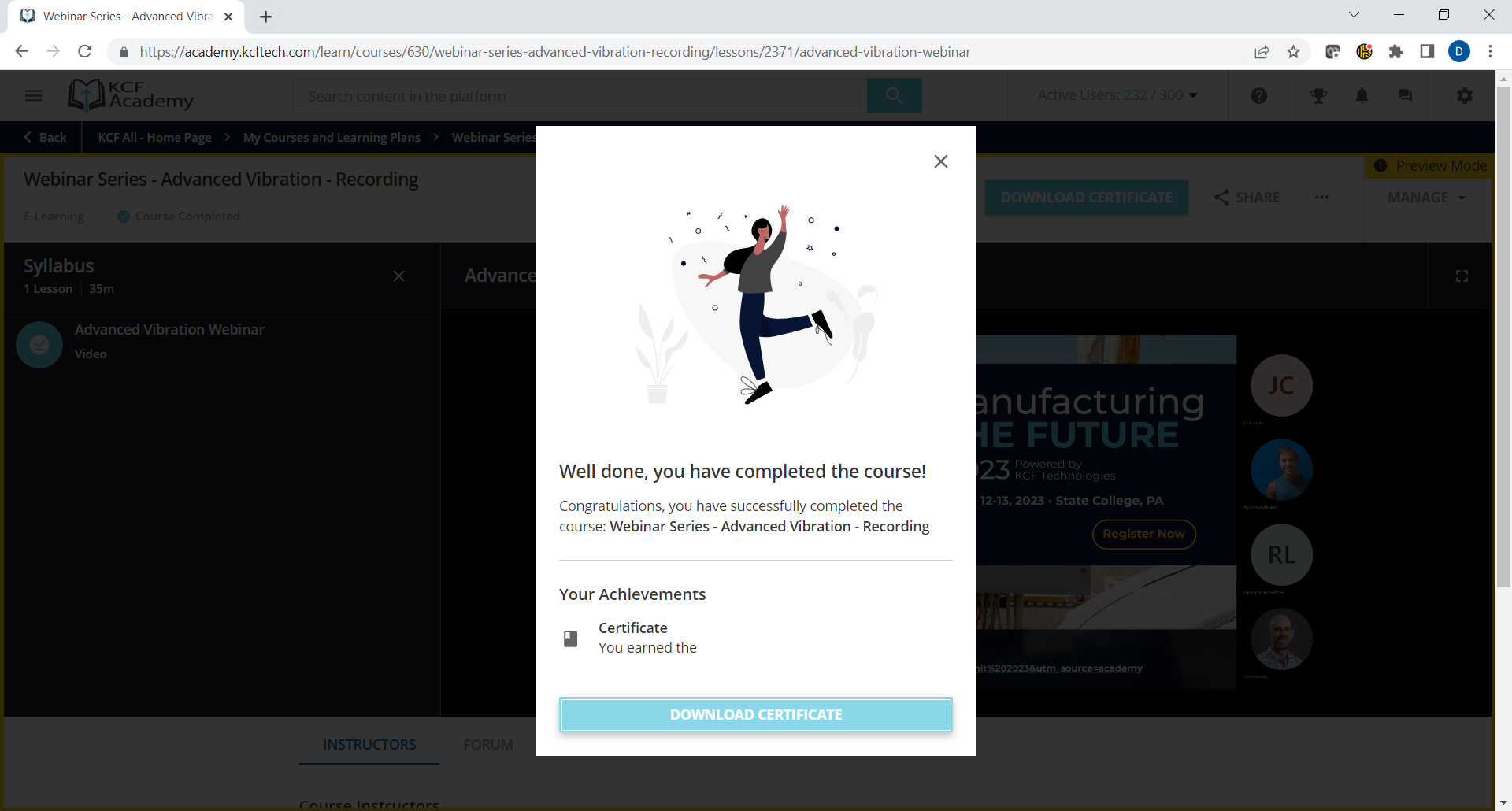
Anybody know the way to change this course completion image in the new course player page using CSS or anything?  This picture isn’t really in keeping with the theme of our audience.


I don’t have access to an environment to look yet, but just general warning to everyone looking for CSS solves to the new changes….remember they are new and there is  alot of feedback for bugs and things, changes that work today may not work for the long run as Docebo may have to implement changes based on feedback or to fix bugs that result in structure changes. Be careful with how much you do down this road until things are a bit more firmed up.


I don’t have access to an environment to look yet, but just general warning to everyone looking for CSS solves to the new changes….remember they are new and there is  alot of feedback for bugs and things, changes that work today may not work for the long run as Docebo may have to implement changes based on feedback or to fix bugs that result in structure changes. Be careful with how much you do down this road until things are a bit more firmed up.

@Bfarkas Is Docebo still pushing this as a mandatory update in the October release… It is my understanding the switch gets flipped for everyone on Oct 2.  Is that not correct?  


@hwolfehall It got pushed to June 2024. 


I know the release as been pushed to the end of 2024 now, but I would still be interested to know if we will be able to change this image if anyone knows.


Reply