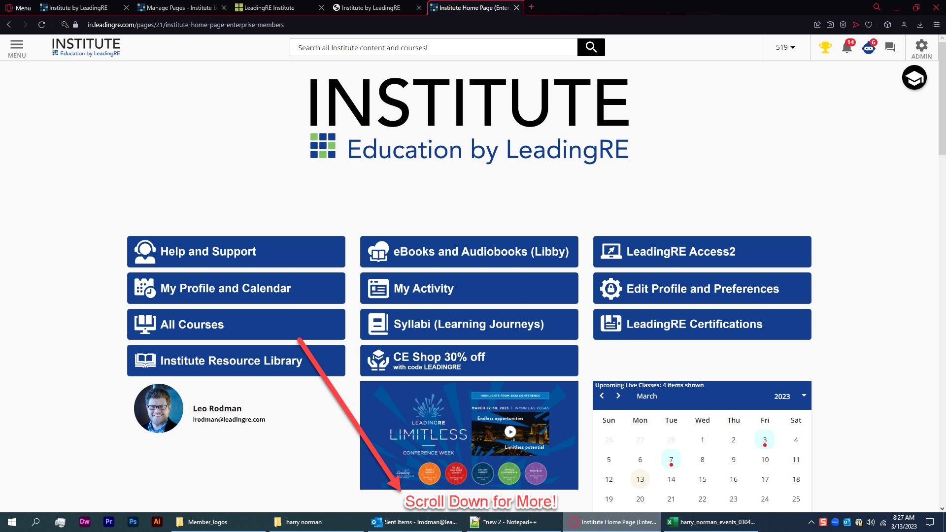
I get a lot of complaints that users don’t know about scrolling down on the home page, and also that users don’t scroll down for pdf attachments in courses.
Does anyone have a good way of indicating “scroll down for more” maybe with animated gifs for these two scenarios?
Off to write some css.. lol

For my homepage it could easily go below (or above) the user profile image and name.


